CSS 实现优惠券样式

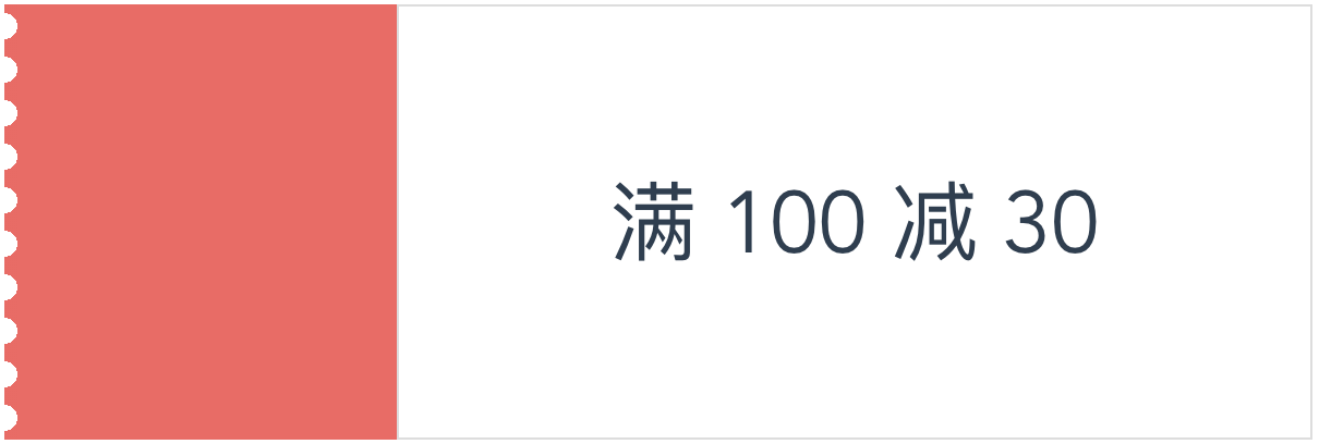
本文将介绍如何使用 css 中的 radial-gradient 实现如下图所示的优惠券样式效果:

绘制基本样式

首先,我们绘制出优惠券的基本样式,这很简单,就不多说了。

1
2
3
4
5
6
7
8
9
10
11
12
13
14
15
16
17
18
19
20
21
22
23
24
25
<div class="voucher">
<div class="left"></div>
<div class="right">满 100 减 30</div>
</div>

/* scss */
.voucher {
width: 600px;
height: 200px;
display: flex;
.left {
width: 30%;
height: 100%;
background-color: #f76260;
}
.right {
height: 100%;
border: 1px solid #ddd;
flex: 1;
display: flex;
align-items: center;
justify-content: center;
font-size: 40px;
}
}

锯齿实现剖析

锯齿部分其实可以看成是十个如下所示的图像片段拼接起来的。每个片段的宽为锯齿的半径 6px,高为 20px。所以我们只需要画出该片段,剩下的重复填充就好了。

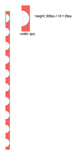
我们把锯齿的样式加在 voucher 的伪元素上面就大功告成了:

1
2
3
4
5
6
7
8
9
10
&::before {
content: '';
position: absolute;
height: 100%;
width: 6px;
left: 0;
top: 0;
background-image: radial-gradient(circle at 0px 10px, white 6px, #f76260 6px);
background-size: 6px 20px;
}

这里的核心代码是 background-image: radial-gradient(circle at 0px 10px, white 6px, #f76260 6px);。它其实是下面这种写法的简写方式:background-image: radial-gradient(circle at 0px 10px, white 0, white 6px, #f76260 6px, #676260 100%);,表示从 (0px, 10px) 的位置开始进行径向渐变,渐变的形状为圆形,从 0 到 6px 由 white 渐变成 white,也就是纯色; 6px 到图形边缘由 #f76260 渐变成 #f76260,也是纯色。

为了重用我们的锯齿样式代码,我们可以定义一个 scss 的 mixin:

1
2
3
4
5
6
7
8
9
10
11
12
13
14
15
16
17
18
19
20
/**
* 为了实现比较好的效果,最好确保:
* 1. $height 可以被 $num 整除
* 2. 2 * $radius < $height / $num
*/
@mixin leftSawtooth($height, $num, $radius, $color, $bgColor) {
$segmentHeight: $height / $num;
height: $height;
&::before {
content: '';
position: absolute;
height: 100%;
width: $radius;
left: 0;
top: 0;
background-image:
radial-gradient(circle at 0px $segmentHeight / 2, $bgColor $radius, $color $radius);
background-size: $radius $segmentHeight;
}
}

这样,用起来就很方便了:

1
@include leftSawtooth(600px, 10, 6px, #f76260, white);

升级版

升级版的锯齿颜色和左边部分的背景颜色不一致,实现上会有些差异,不过思路还是一致的。

首先还是绘制出基本的样式:

1
2
3
4
5
6
7
8
9
10
11
12
13
14
15
16
17
18
19
20
21
22
.voucher {
width: 600px;
height: 200px;
margin: 20px auto;
display: flex;
position: relative;
border: 1px solid #ddd;
.left {
width: 30%;
height: 100%;
border-right: 1px dashed #ddd;
}

.right {
height: 100%;
flex: 1;
display: flex;
align-items: center;
justify-content: center;
font-size: 40px;
}
}

然后,绘制锯齿部分。注意,这里圆的半径是空白部分5px加上1px的边框,所以背景片段绘制需要额外加一段渐变:

1
2
3
4
5
6
background-image: radial-gradient(circle at 0px 10px,
white 5px, /* 圆内的颜色是背景色 */
#ddd 5px,
#ddd 6px,
transparent 6px /* 圆外的颜色是透明色 */
);

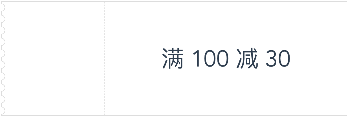
注意到我们把圆内的颜色设置为背景色,圆外的颜色设置为透明色,为什么要这样后面会有说明。现在的效果离目标已经越来越近了,不过还是有点出入:

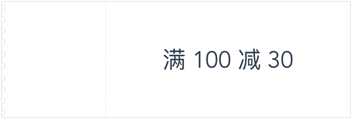
解决办法是把伪元素往左移动一个边框大小的位置。这样半圆左边的线会被圆内的颜色覆盖,而其他地方因为是透明色,所以线会保留(这就是为什么要把圆内的颜色设置为背景色,圆外的颜色设置为透明色的原因了)。

完整的 mixin 如下所示:

1
2
3
4
5
6
7
8
9
10
11
12
13
14
15
16
17
18
19
20
21
@mixin leftSawtoothBorder($height, $num, $radius, $bgColor, $borderColor, $borderWidth) {
$segmentHeight: $height / $num;
$extendedRadius: $radius + $borderWidth;
height: $height;
border: $borderWidth solid $borderColor;
&::before {
content: '';
position: absolute;
height: 100%;
width: $extendedRadius;
left: -$borderWidth;
top: 0;
background-image: radial-gradient(circle at 0px $segmentHeight / 2,
$bgColor $radius,
$borderColor $radius,
$borderColor $extendedRadius,
transparent $extendedRadius
);
background-size: $extendedRadius $segmentHeight;
}
}