CSS 实现优惠券样式(进阶版)

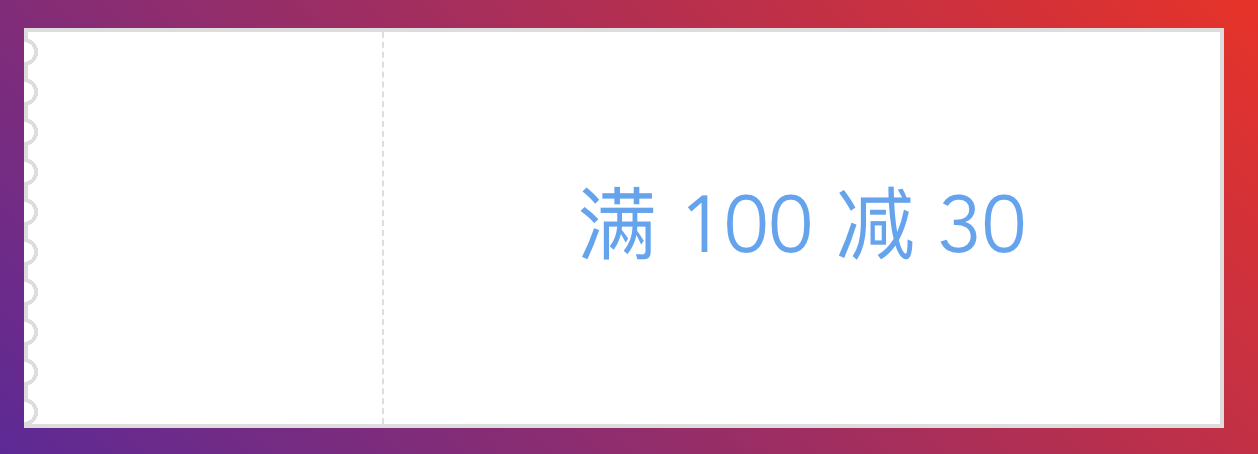
之前通过 radial-gradient 实现过一个优惠券样式,但是该方案并不完美,一旦优惠券的背景不是纯色的话就无能为力了:

那就继续改进吧

锯齿部分剖析

参考之前的思路,锯齿部分仍然可以看做是几个图形片段组合而成,而每一个小的图形片段又可以分解成两部分:

这样我们可以用 beforeafter 两个伪元素分别来绘制这两部分。之前的锯齿部分是在父元素内的,现在要往左移动一个锯齿宽度,即要伸出父元素外。完整的代码如下所示:

1
2
3
4
5
6
7
8
9
10
11
12
13
14
15
16
17
18
19
20
21
22
23
24
25
26
27
28
29
30
31
32
33
34
35
36
37
38
39
40
41
42
43
44
45
46
47
48
49
50
51
52
53
@mixin leftSawtoothBorder(
$height, // 优惠券的高度
$num, // 锯齿个数,最好可以整除高度
$radius, // 锯齿的半径
$bgColor, // 优惠券的背景
$borderColor, // 优惠券边框颜色
$borderWidth // 边框宽度
) {
$segmentHeight: $height / $num;
$extendedRadius: $radius + $borderWidth;
height: $height;
border: $borderWidth solid $borderColor;
border-left: none;
box-sizing: content-box;

&::before {
content: '';
box-sizing: content-box;
position: absolute;
border-top: $borderWidth solid $borderColor; // 上下绘制边框接上父元素的边框
border-bottom: $borderWidth solid $borderColor;
height: 100%;
width: $extendedRadius;
left: -$extendedRadius; // 往左偏移一个锯齿宽度
top: -$borderWidth; // 往上偏移边框的大小
background-image: radial-gradient(
circle at 0px $segmentHeight / 2,
transparent $radius,
$borderColor $radius,
$borderColor $extendedRadius,
$bgColor $extendedRadius
);
background-size: $extendedRadius $segmentHeight;
}

$h: ($segmentHeight - 2 * $extendedRadius) / 2;
&::after {
content: '';
position: absolute;
height: 100%;
width: $borderWidth;
left: -$extendedRadius;
top: 0;
background-image: linear-gradient(
to bottom,
$borderColor $h,
transparent $h,
transparent $h + 2 * $extendedRadius,
$borderColor $h + 2 * $extendedRadius
);
background-size: $borderWidth $segmentHeight;
}
}

最终效果